How Good is Physical Therapy (PT) for Musculoskeletal (MSK) Issues? And How Good is Claude for Literature Review?
- Dates: 2026-02-28 - present
- Status: unfinished
- Importance: 4
Having undergone physical therapy (PT) for shoulder issues, I wanted to see what the medical literature says about the quantitative benefits of PT. I looked for answers from literature reviews like this:
But these reviews were hard to understand: the data were scattered in different formats across individual studies. So I invested a Saturday with Claude Code and made this:
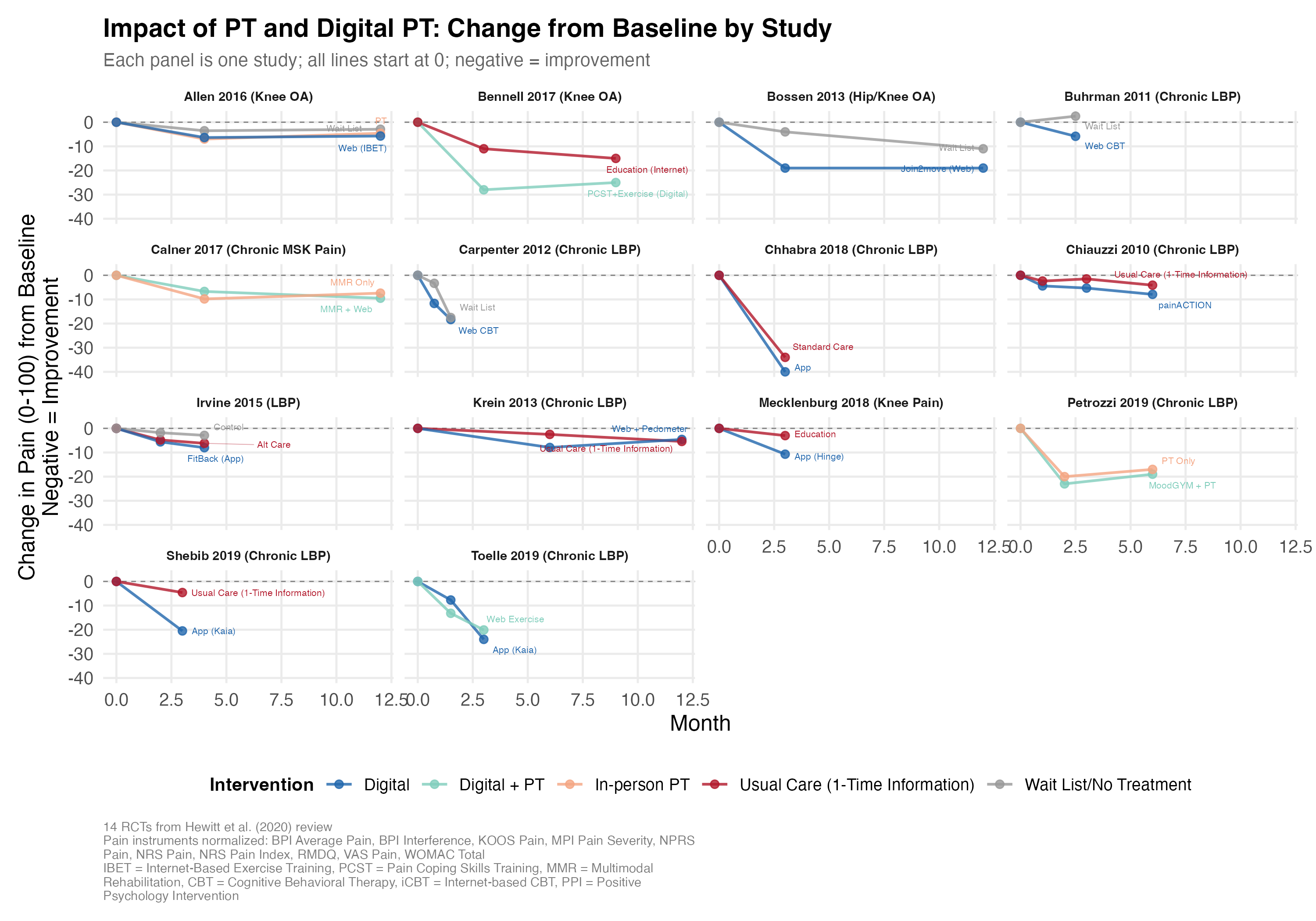
The tl;dr: across these studies, people with MSK issues like knee and back pain reported an average of 0-15 points lower pain (on a 100-point scale) after undergoing PT or digital PT (blue, teal, salmon) versus no treatment or a one-time informational session (red, gray).
I had fun and frustration (a) cramming all 14 studies’ (2,660 patients’) worth of results into one figure (a “visual literature review”) and then (b) using Claude Code to extract the data from the papers. I found that Claude Opus 4.6 was hallucinating the extracted data until I provided it copies of all the study PDFs. Read on to learn more…
“Visual Literature Review” (i.e. Infographic)
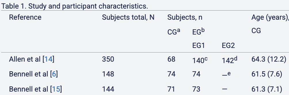
I focused on this Hewitt et al. 2020 review of studies of (digital) PT effectiveness. It summarized these studies as follows:
All 19 included studies used outcomes that assessed pain. Of these, 9 reported statistically significant improvements in pain [6,15,16,23-26,28,29,32,33].
One might interpret this as “PT improves things about half the time” (9/19 studies). But I found this summary to be unsatisfying:
- The first statistically insignificant study I found showed an effect that was almost statistically significant; the summary didn’t convey that.
- I wanted to know how much of recovery is due to the passage of time (natural healing) versus the intervention itself.
- I wanted to know how long recovery tended to take.
I realized that I could plausibly capture all this information in an understandable way by using graphs–they’re visual! The challenge then became to cram all the studies into one visual.
Challenge of Standardizing Studies
The main issue with this was standardization. The studies varied tremendously:
- They measured different outcomes (pain, disability, quality of life) with different questionnaires.
- They studied different populations in different countries with different MSK issues.
- They had different treatment and control groups (sometimes the control group actually got in-person PT treatment, and sometimes they got nothing).
I addressed these as follows:
- I focused on the pain outcome and found that, despite the variety of questionnaires, they all essentially asked a series of questions like, “How severe is your pain (from 1-5) when doing activity X?” So I scaled all the results to a scale of 0-100 (no pain to maximum pain) and decided it was OK to plot the pain ratings on the same y-axes.
- I decided to show but not emphasize differences in body region affected, severity, or country. My hope was that if PT has an effect, it would show up across body regions.
- I specifically categorized each treatment/control group into one of the five aforementioned treatment categories.
First Pass at Extracting Data with Claude
Well to be precise, I had Claude do the above standardizations. I prompted Claude:
Can you make me a graph that looks kinda like this but with the results of a bunch of studies overlaid in one graph, not just this one? The studies are all of digital PT or PT interventions and tracking patients’ outcomes (usually pain/disability/function scores) over time during the intervention or control. So it seems plausible to overlay a bunch in one graph. Let’s start with all the studies in this review: https://www.jmir.org/2020/6/e15617/.
Notes: (1) some of the studies already made a results figure like this (e.g. the example is from Allen et al. 2018). some didn’t (e.g. Irvine et al: https://www.jmir.org/2015/1/e1/). But the numbers are there in the Irvine study, so you can make a graph from those. (2) it’d be nice to visually distinguish the lines by treatment/control, the type of intervention, and maybe the severity of injury/pain in the population being studied.
Please either generate the graph or write some R code to do so
Claude churned for 5 minutes and produced a 450-line R script and a beautiful (non-R?) figure:
I was ecstatic! Claude had extracted a bunch of results, treatment categories, and time points, and written all the rescaling and figure code. Most importantly, the figure looked great!
I decided to check the data for one of the studies just to be sure, and found… the numbers were slightly off–3.3 vs 3.5, 3.1 vs. 3.3. I found that odd and checked another. Way off this time. I checked one more and found that Claude had made up a timepoint.
A bit annoyed, I showed the discrepancies to Claude and asked it to verify all the data it had extracted. It churned for a few minutes and said that it couldn’t access the full study texts for almost all the papers, and so it could not verify the vast majority of the data. How did Claude come up with the numbers at all then? Claude said it had hallucinated.
A Second Pass and Answer
I got all the study PDFs and asked Claude Code to read the PDFs and do the tedious work of verifying all 19 studies. I watched in wonder as Claude spun up six agents in parallel, each one ingesting a full paper for a few minutes and then printing statements like, “4.9 should be 4.7; see Table 3.” After 10 minutes, Claude was done, and spit out its assessment for each study. It claimed that the extracted data for 17 of the 19 studies were wrong, and stated its corrections.
I crossed my fingers and looked at the first study to be corrected. I found that, in fact, the correction was exactly correct this time. I checked another study; it was also exactly correct. After checking a few more, I breathed relief and trusted the extraction.
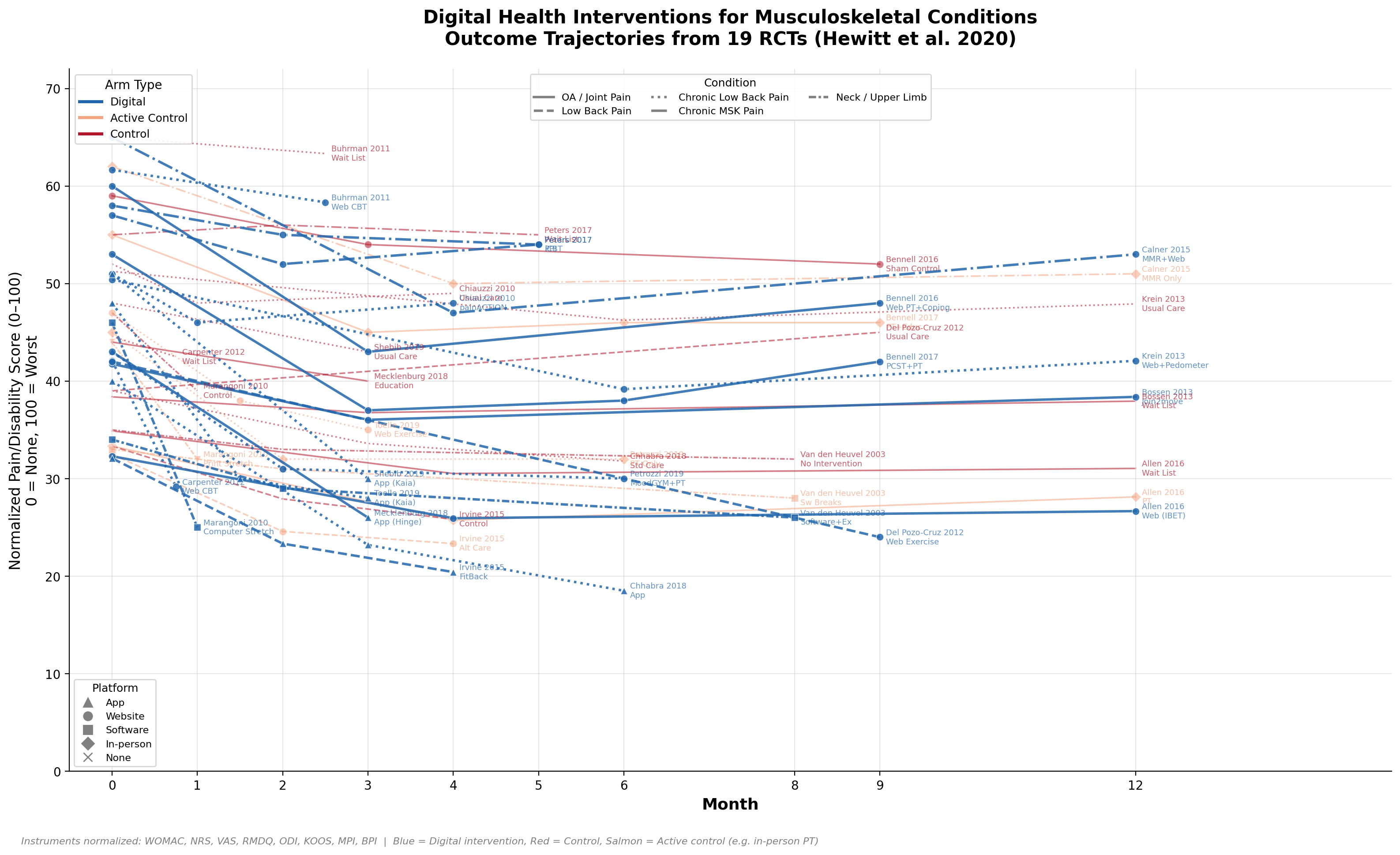
Despite the bumpy ride, Claude had saved me hours of tedious extraction and plotting work. And we had a nice visual answer to our question about PT effectiveness. In addition to the figure at the top, I also overlaid all the studies:
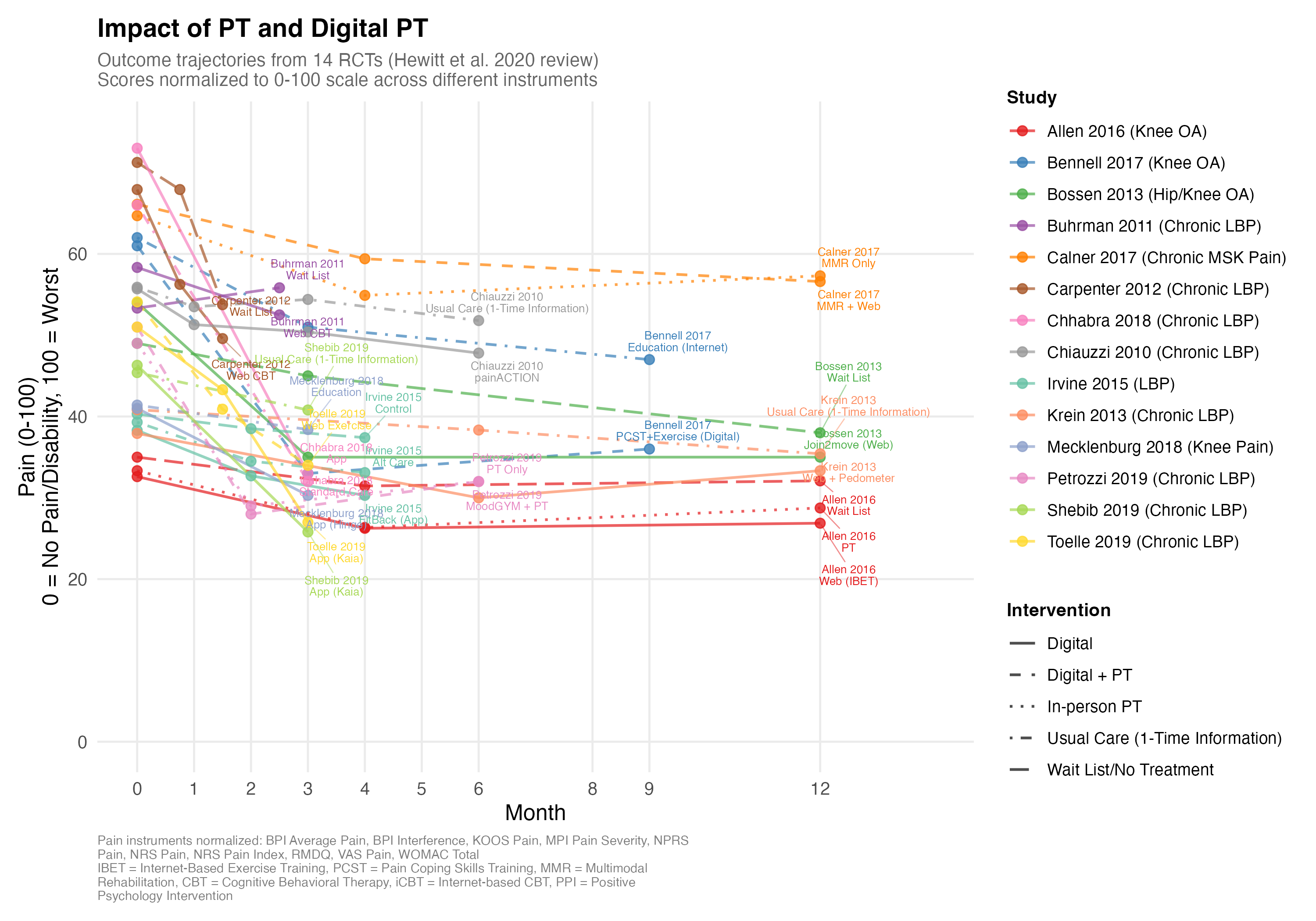
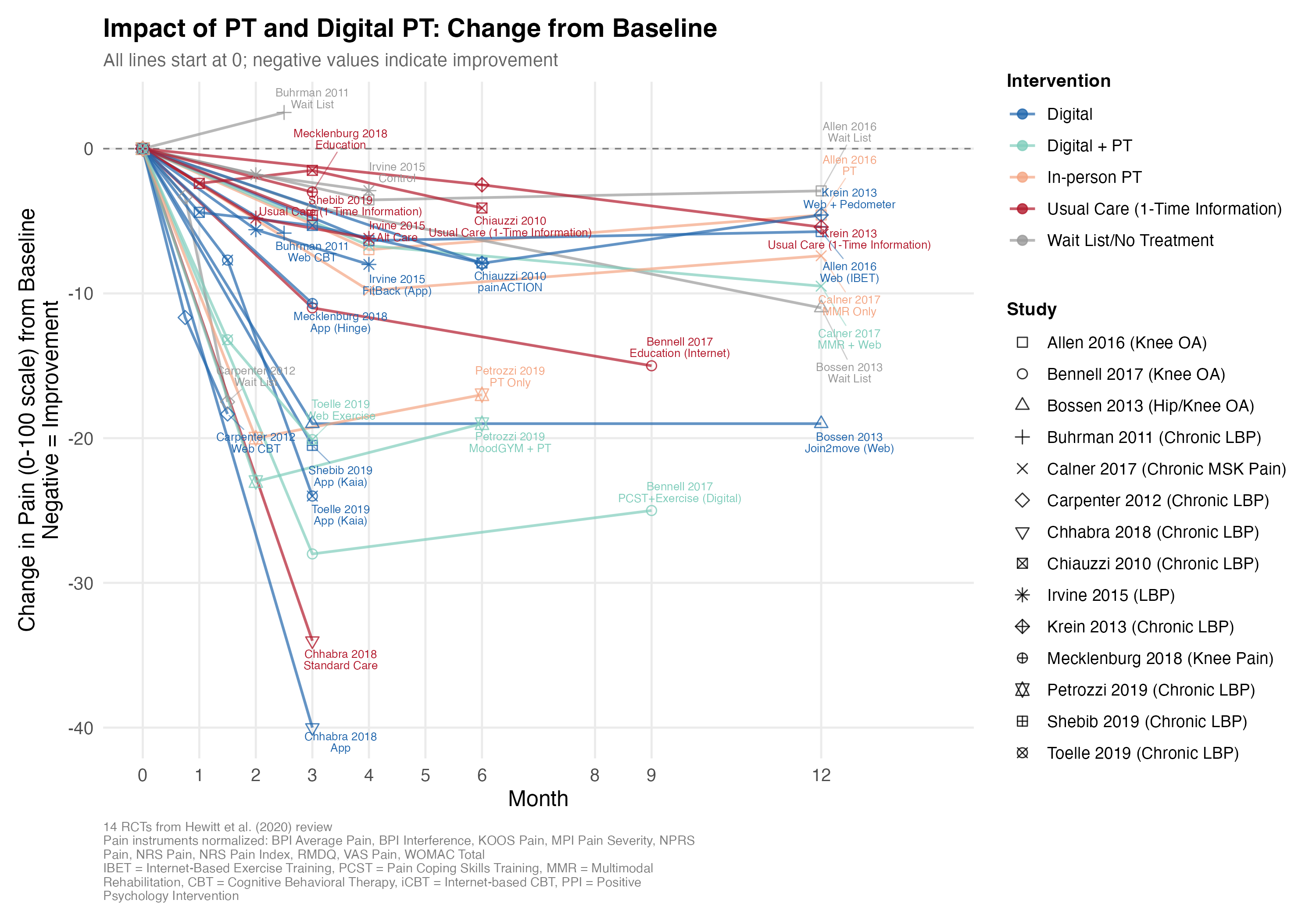
My summary of these graphs: on average, “recovery” seems to amount to 0-25% reductions in pain, takes months, and involves both components of natural healing and some improvement from PT.
One Last Mystery
One last thing bothered me: some of the numbers from Claude’s first pass had been very close! How did Claude do that if it hallucinated without access to the papers? After looking at Claude’s chain of thought, here’s my guess: when Claude was close, it used data from the review paper supplement (which stated some of the individual study results) and fudged the numbers slightly for some reason; when Claude wasn’t close, it just imputed plausible numbers/measures from other studies.
I think the figures could still be improved with error bars and sample sizes, and I worry about an occasional error in one of the extractions. But I generally trust the answers I’ve stated above.